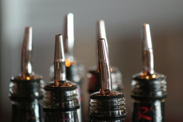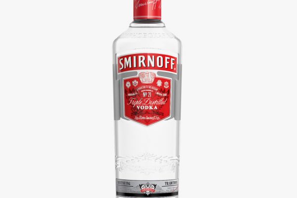
The label of Smirnoff, the world’s biggest vodka brand, is to undergo a redesign, which will place stronger visual emphasis on the Smirnoff banner on its bottles through typography that is more "contemporary,” thedrinksbusiness.com and the thegrocer.co.uk report.
The vodka’s ‘iconic’ No. 21 bottle label will be revamped as an acknowledgement of the "contemporary spirit and vibrancy" of the 17.7 million people who consume the beverage, Julie Bramham, marketing director for Smirnoff Western Europe, said.
The packaging transformation will be accompanied by a £4.5 million advertising campaign entitled We’re Open, which will be pan-European.
Bramham stated, “This is a really exciting period for Smirnoff and we’re looking forward to seeing the new packaging on store shelves and in bars and restaurants across Europe in the coming months. The new design was borne from a desire to reflect some of our amazing 151-year history, whilst also wanting to include a nod to the contemporary spirit and vibrancy of our drinkers.
“We feel the new design really bring [sic] this to life in a way which delivers brilliant shelf standout and hope that the 17.7 million people who drink Smirnoff across Europe will agree.”
© 2015 European Supermarket Magazine – your source for the latest retail news. Article by Peter Donnelly.